
Picking the right paint colors for the walls is one of the hardest decision to make. Color is so subjective and people react so differently to the same colors and there are literally hundreds of colors to choose from. It becomes more challenging when selecting colors for spaces that several people will be sharing and living in.
Early on in the design process we agreed to keep a soothing, light neutral palette for all the common rooms – kitchen, living room, dining room, halls, etc. Therefore ensuring a non-controversial and coordinated interior that everyone can live with. For each of our own bedrooms we agreed to choose whatever we personally like – bold, soft or stay neutral.
I pulled together a palette from the historical collections of three top paint companies – Benjamin Moore, California Paints and Sherwin Williams. These colors tend to be more muted and are certainly well suited for a rural farmhouse from 1786.
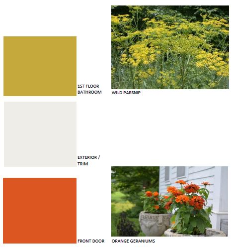
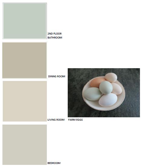
Taking cues from the soft and serene colors of farm fresh eggs, the majority of rooms are a cool neutral color with hints of blue and/or green. For the bathroom downstairs I was inspired by the yellow/green flowers of the abundantly growing Wild Parsnip. This is obviously not a neutral color but I thought it would be fun to inject a punch of color in a small space.
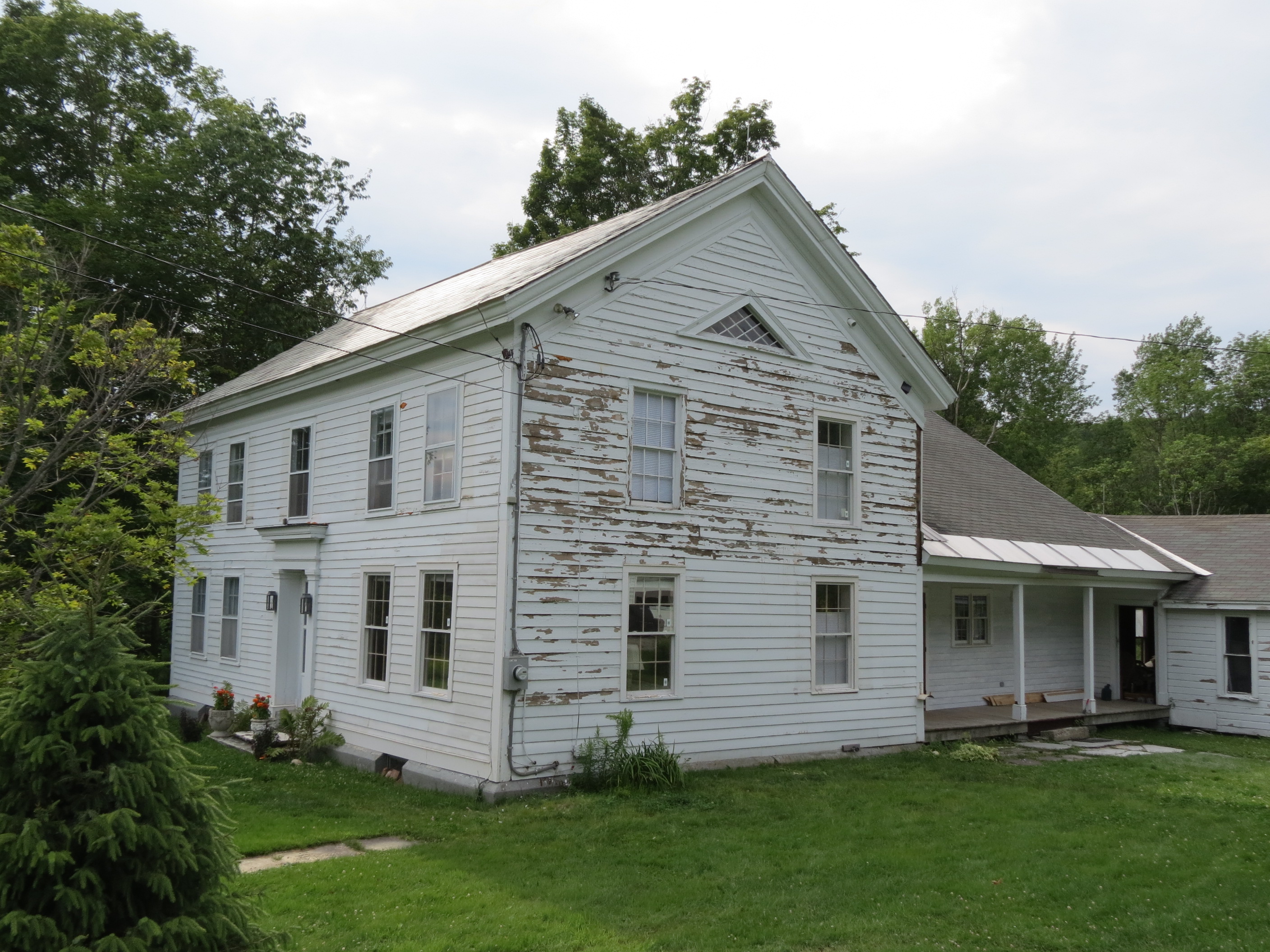
Selecting the color for the exterior of the house was a bit more of a challenge. In the end we agreed to stay with a traditional farmhouse white – albeit a soft, historic white – and add a punch of color with the front door. Again taking color cue from nature, this time the orange/rust geraniums that we planted in early Summer.

Since this is a vacation home, not a year-round residence, I’m going a little bolder in our bedroom than I normally would. The walls have been painted a lovely mid-tone grey blue, Benjamin Moore’s Van Courtland Blue, our duvet cover is cream with a raspberry stripe, and I painted two bedside tables a marigold yellow. I love how the yellow tables pop against the blue walls but also work with the cream and muted red bed covering.
Next up is finding or creating a focal point to hang on the long wall behind the bed. My original thought was to create three large canvas leaf prints in green, but so far I have not been happy with my test prints (of large hosta leaves), so now I’m on the hunt for an inexpensive quilt wall hanging or a cool, relatively cheap, art piece….
Then there’s the lighting – right now, we have a bare Edison bulb for the overhead light, and two mis-matched wooden based table lamps as reading lights. I’d love to find matching ceramic lamps with granny smith apple green bases and white shades, but so far haven’t found the perfect ones. The hunt continues!
LikeLike